Polygon Fees

Introduction
This investigation is all about Polygon vs Ethereum transaction fees since July 1st and more specifically looking at how and if they’re correlated somehow.
Key Action Points
- Compare transaction fees on
Polygonto fees onEthereumover the same time period - are they correlated? - Do they diverge significantly at any points?
Method
- Start with on-chain (
velocity-available data points) - Fill in the missing data points from CoinGecko’s API to try to get a better idea of what is going on, without any missing values
- Look at some more “creative” metrics and compare the two networks
AT THE TIME OF CREATING THIS DASHBOARD THE TWO BELLOW GRAPHS DID NOT HAVE token price DATA, hence why I used Python and CoinGecko for the analysis.
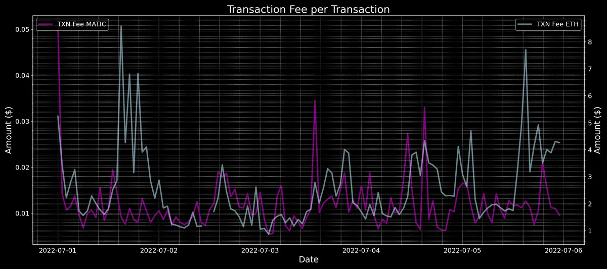
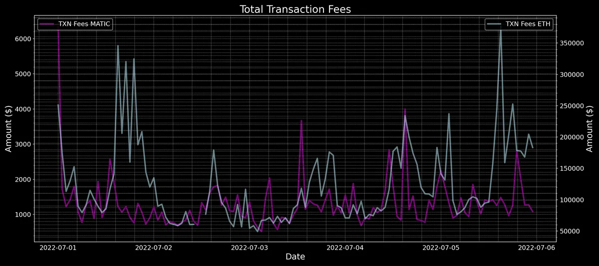
What we can see is that both in terms of Total Transaction fees in $ and in Transaction fees per Transaction, there’s a correlation, at least in the first few data points, with then a divergence where ETH Transaction fees take off. Obviously, this is not a good conclusion especially as it’s been derived from only a few data points. In order to make a better, more concrete conclusion, let’s look at more complete data by joining the on-chain data with off-chain data from CoinGecko to give us the $ values.
Combination of Sources
Let’s now look at a combination of both on and off-chain data w.r.t. to transaction fees to try to make a more established conclusion about whether or not there’s any correlation.


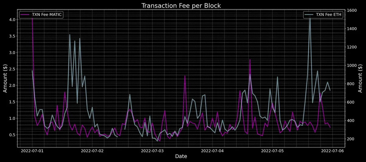
In all of the different metrics, there’s a significant correlation in the beginning which then goes away, then again around the 2nd and 3rd of July that sort of continues until the end of 5th of July which leads to another deviation from each other.
Of course, these metrics are not exactly correlated, but correlated by an order of magnitude always, as dividing one by the other will give us always a much higher value for the ETH fees than the Polygon fees, but what it can give us is a sense of correlation between them.
Next, let’s look at some more “creative” metrics that do not really have a meaning in terms of comparing them against each other in terms of face value, but can give us a deeper look at the correlation between gas price and fees between the two networks.
In terms of the Gas Price in gwei comparison between the two networks, while it does help show us the parts where the two networks are correlated in terms of gas price, it does not really offer any meaningful information in terms of which one is more “expensive” or which one accrued the most value. It is mainly shown here to indicate where those peaks and troughs align with one another.
In terms of the Gas Price ratio comparison between the two networks, it gives us an indication of how correlated the different spikes between the networks are, in gwei denominated terms, here the parts that are flat and next to each other are the parts where there’s an absolute correlation, whereas the spikes and troughs here indicate deviations in terms of loss of correlation between the two.
Summary
In summary, we can see that there is a significant degree of correlation at parts between the two networks in terms of their fees and gas activity. This could be due to many reasons, one of which could be wallets bridging between networks, i.e. when there’s a deposit on either end and withdrawals on either end there’s a State Sync transaction on the receiving network which mints the tokens sent over, while on the other side a withdraw that shows as a Transfer that burns the tokens using the ERC20Predicate contracts on either side. This back and forth bridging to maybe do certain transactions in low fees and then move the funds again on the other side Ethereum for example, could be one of the reasons for correlation, but I suspect this is only a very small component of the correlation. I am sure there’s more here than meets the eye and maybe it warrants a full-on investigation.
Evaluation & Discussion
It does suck that there’s data missing and I was not able to complete all of these graphs using on-chain data, but nonetheless, I feel like there’s enough here to at least touch upon the general correlation between the two.
Some Interesting Next steps:
- Pearson Correlation Score
- Seasonality Checks
- Structural Breaks in their Ratio
- Time Lagged Cross-Correlation
- Dynamic Time Warping
- Time Series Modeling (ARMA Models, etc.)