Price + Circulating Supply
Draw a chart showing MATIC’s circulating supply from the start till today. Compare it with MATIC’s price.
Data Sources
All data presented today come from CoinGecko API and are plotted in Python. Using the following: https://api.coingecko.com/api/v3/coins/matic-network/market_chart?vs_currency=usd&days=max
Circulating Supply & Price
What is Circulating Supply
The term 'circulating supply' refers to the number of tokens currently circulating on the market that market participants can own and trade. It is essential metric investors use to compare the valuations of different tokens.
Let's now look at the circulating supply and the price of MATIC over the past year.
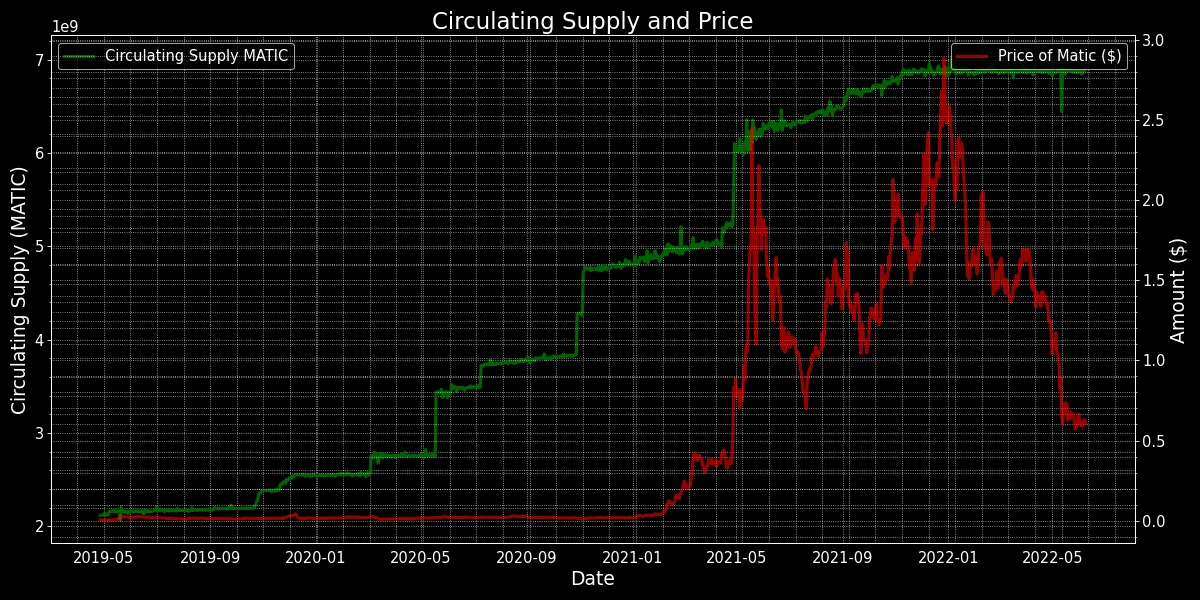
What we can see is that the circulating supply increases with some periodicity of approximately every 6-7 months for bigger increases, whilst smaller increases do not seem to have the same periodicity as the shorter spikes are within a linear increase in the supply. What we can see is that when there's a rally in terms of price, circulating supply increases as well, either linearly (recently) or in steps (in the past). What we can also see from this graph is this massive spike downwards in supply, which coincides with the collapse of Terra. It looks to me as if a lot of tokens got burned or redeemed, potentially the tokens that were on the Terra, now Terra Classic, blockchain through the wormhole bridge.
When we look at them side by side the only correlation really is how with a growing market cap the circulating supply will also increase as market_cap = circ_supply*price. What we are seeing here is that as the price increases the circulating supply also has increased.