Yet another Acme Question
Q184. Refer to submissions for #175 - your own, or those of others. Pick your favourite Terra metric or visualization and recreate your own version. Your SQL can be similar or even identical to the original, but you should put your own narrative and explanation. Why is this metric/visualization your favourite? If you improved it, what changes did you make?
Introduction
The metrics I will be discussing today are on a network level and have been sourced through my previous submission, but more specifically sourced from LUNA Intelligence.
The metric I will be reviewing/mutating today is the number of daily transactions and contract interactions. (see bellow)
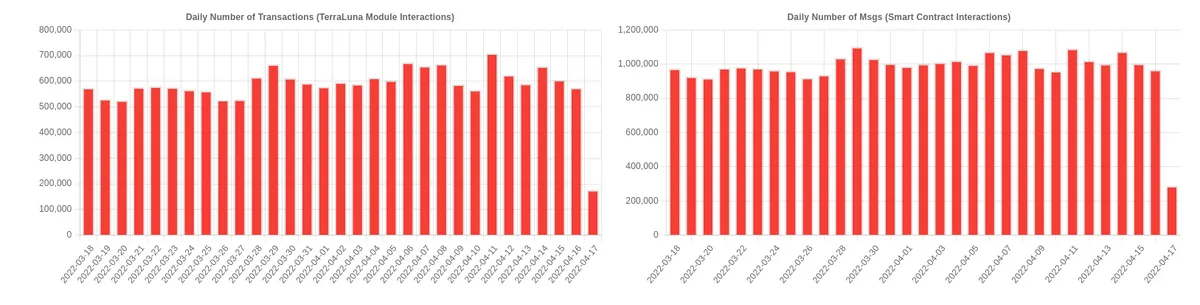
Whilst these metrics themselves are good indicators and provide specific utility when it comes to getting an idea of contract utilization and module interactions. The thing I do not like with these two metrics is that they are very correlated and that there is no other metric that encapsulates more generally, active wallets, the number of transactions as well as even how many transactions on average a unique active wallet performs, on a daily/weekly/monthly view.
The weekly...
And the Monthly...
All of which show a consistent growth (always excluding the last data point in our views) as it is the incomplete one on both the daily/weekly and monthly.
All of them served different purposes, for example, the weekly and monthly help look at the bigger picture and hide the daily fluctuations.
The weekly...
And monthly...
All showing very similar things (when looking at the bigger picture to each other), network growth and an increasingly larger amount of active wallets. This and the number of transactions is very correlated as well, but they each contain specific information about the network.
Average transaction count per unique wallet
This metric shows how many transactions each unique wallet performs on average daily. It is useful to know on average if people are actively transacting or not. This number again shows us the average number of transactions per active wallet. It can be used to gauge daily dips or increases in the count, which could then further be investigated per smart contract interaction.
Let's first look at the daily...
The weekly...
The monthly...
What can be seen here is that as the transaction count increases (regardless of the timeframe), this average value decreases, which indicates that the average user is doing a bare minimum of transacting with the network daily and that probably there are only a handful of wallets that actively interact with the ecosystem. Either that being via the terra-sdk or some other way.
A different way to also visualise this decline is by viewing the components of the ratio plotted against each other (See bellow).
Weekly graph, for clarity, of Transaction count vs Unique Addresses. What is seen is that their ratio is stagnating.
In a way, this is expected to happen with time. Although more analysis needs to be done to gauge specific active wallets, how they interact with the ecosystem and how many of the inactive ones are just hold/accumulation wallets.