Citizens of NEAR
Introduction
This dashboard analyses the following aspects of the NEAR network:
- The daily number of daily users
- The daily number of transactions executed
- The total number of daily users in the past 90 days
- The total number of transactions executed in the past 90 days
- The daily gas used by NEAR users
This bounty asks to analyse those results and suggest who the citizens would be, if NEAR were a city? In order to answer this question, I will look into possible correlations between the results obtained and some geographical data.

\
Methodology
Firstly, it is important to define what an active user is. Conveniently, Flipside has access to a community-created metrics_active_wallets table, which presents this information for us quite neatly. By looking at the dbt docs, we can see what the table defines active users to be:
COUNT(
            DISTINCT tx_signer
        ) AS daily_active_wallets
This definition is not exactly what I would go for if I was to make the table myself, however, I decided that it is a good enough definition to conduct some analysis based on it.
The only problem that I have faced while writing the queries was that the mentioned table returned many double-counted results for each day, and therefore what you will see on the graphs is the maximum number per day, for daily users and for daily transactions.
Next, it’s time to find out which city NEAR’s citizens would belong to!
As we can see, the total active user count as of now stands at 1.24M. By looking at the world city populations, this number would correlate to either Barquisimeto in Venezuela or Jieyang in China - how cool!
Jieyang below and Barquisimeto on the right.


As we can see, there is a strong correlation between the number of daily transactions and the count of daily users. By looking at the bar charts above, we can see several spikes in the number of daily active users as well as spikes in the number of transactions. These events could be caused by different events, such as general speculation in the market or a launch of new NEAR protocols or products.
In order to visualise the correlation even more clearly, we can look at a scatter graph that shows the number of daily users, coloured by the number of daily transactions. We can see that during May, the number of daily users increased quite significantly, followed by a big increase in daily transactions. In summary, we can see here that if there is an increase in active users, there will also be an increase in daily transactions executed. The next step is to look at the gas paid by NEAR’s users in the past 90 days.
We can see that NEAR’s users pay quite a lot of gas in total - which correlates with the spikes in a daily number of transactions. In other words, we can see here what we would normally expect - the more transactions there are, the more gas is paid by users in total.
Going back to the main question of this bounty - what city would NEAR’s citizens belong to?
Let’s correlate the gas prices paid by NEAR’s users to the prices of gas paid by people in different cities - except not the transaction gas, but the gas used to fuel cars! (pun intended 😆)
If we look at the biggest spike shown on this chart, we can see that users paid just over 30M NEAR on gas fees. At the current price of the token, this translates into roughly $100M. Which city in the world buys an equivalent of $100M in fuel per day to drive around?
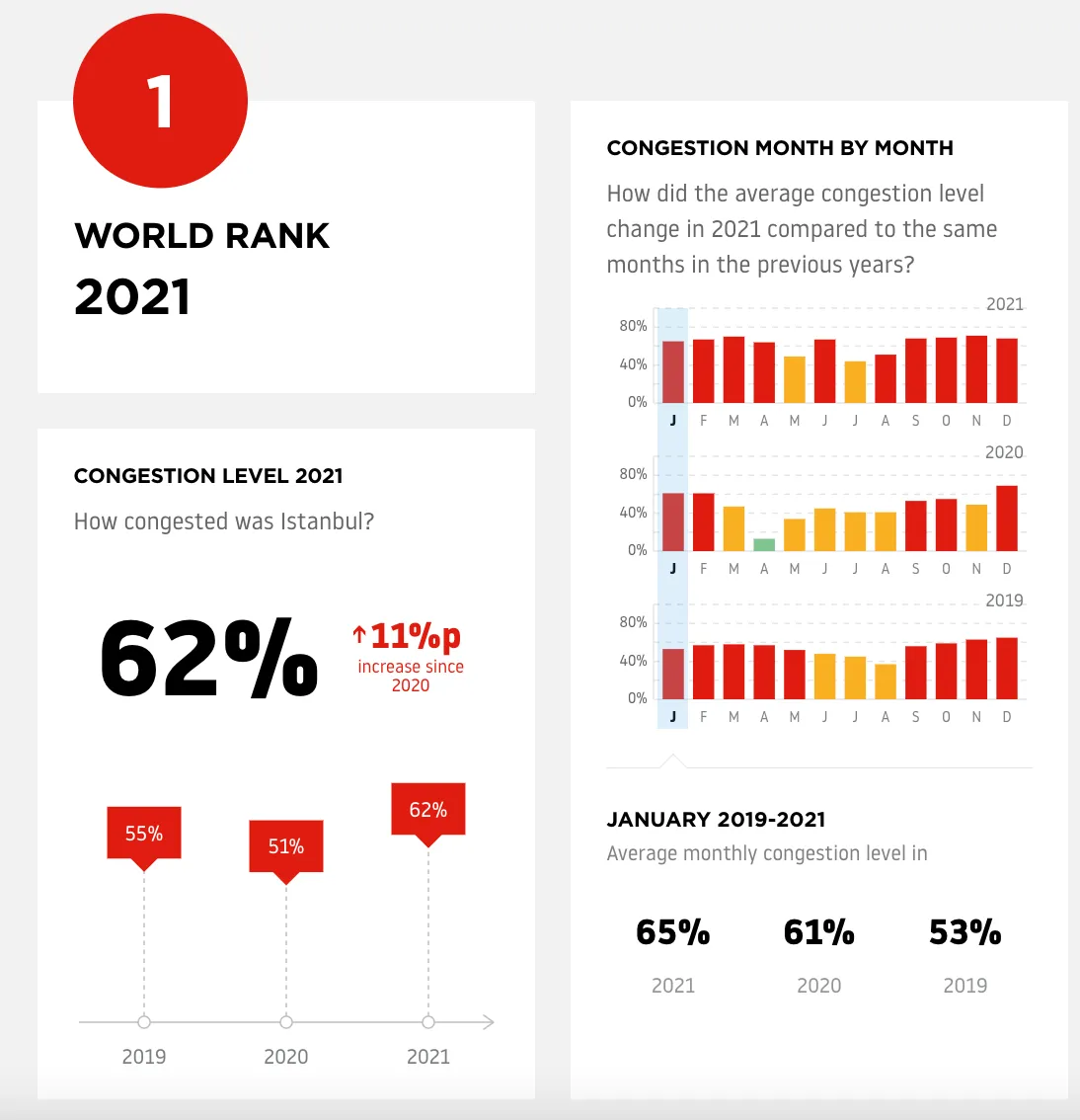
Looking for a correlation as such is very difficult - there are many assumptions to consider and many metrics that change for cities. For example, I could go by estimating how many cars there are in different cities and how much fuel they use on average in order to calculate how much money is spent on gas per city. However, this doesn’t take into account the fact that in some cities fuel is cheaper, or that in other cities people drive more electric cars and in addition, data as such is not widely available online for all cities. Therefore, I have decided to look into a Traffic Congestion Ranking for 2021 in order to draw this rough correlation - as the more traffic there is, the more fuel is burnt - the more money is spent on fuel. The winner in this category is Istanbul in Turkey!


Conclusion
In summary, this dashboard looked into the daily active users, and the daily number of transactions and looked into correlations between the two. I have also investigated the daily fees paid by NEAR’s users.
In conclusion, we have found out that if NEAR were a city, its citizens would be from either Barquisimeto in Venezuela or Jieyang in China or Istanbul in Turkey - depending on what we focus our analysis on, whether we look at the number of active users or a rough estimate of money spent on fuel (which was just a funny way to explore the pun).