Aave on Optimism
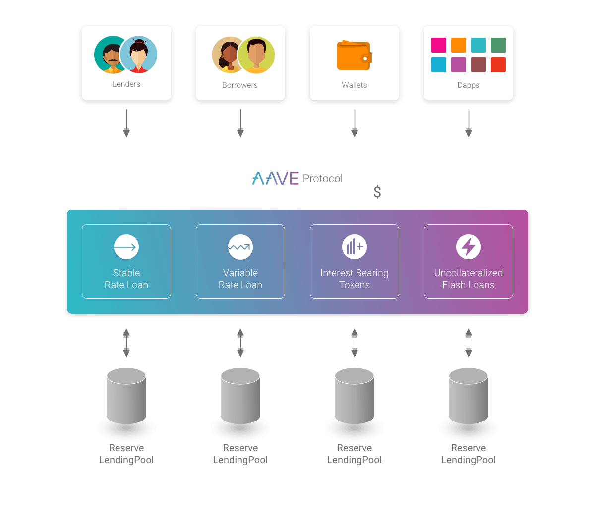
Aave is a decentralized non-custodial liquidity protocol where users can participate as depositors or borrowers. Depositors provide liquidity to the market to earn a passive income, while borrowers are able to borrow against their colletralized tokens. Aave is also known by its unique partys which calling as rAave

So, in this dashboard, we'll be checking out the status of Optimistic Aave. Aave was launched on Optimism on March 11, 2022, and only Aave v3 is available on Optimism. Aave relies on a bunch of smart-contracts and their documentation is pretty solid. If you're curious, you can check out their contracts via this link: https://docs.aave.com/developers/deployed-contracts/v3-mainnet/optimism.
So, in this dashboard, you'll see some graphs that are limited to the last 90 days, while others will show you the current status. I've applied this 90-day criteria to ensure that the visualizations are clearer and easier to understand.
Let's dive into some metrics that go beyond just the basic functionalities of Aave. We'll be taking a look at the amounts supplied, borrowed, withdrew, and repaid in USD for each token over the past 90 days. After that, we'll check out the number of users segmented by these functions in a separate graph. And lastly we are going to see interest rates.
As you see there are two different graphs for borrowing rates thats why when borrowing, Aave, offers two different options on interest rate one of them is Stable and other one is variable but what is the differenece between them ?
Stable rates act as a fixed rate in the short-term, but can be re-balanced in the long-term in response to changes in market conditions. The variable rate is the rate based on the offer and demand in Aave. The stable rate, as its name indicates, will remain pretty stable and it is the best option to plan how much interest you will have to pay. The variable rate will change over time and could be the optimal rate depending on market conditions.
On the right side we are seeing interest rate choses(proportionaly) not user by user, it has arranged according to volume.
And one more thing about interest graphs: If you go to Aave and check for the interest rates there you may see some differences between graphs, reason of this case, graphs comes from on-chain data but Aave does not reflect everything to their web-site, for example currently Aave does not have borrowing $OP option but graphs says they are offering this option with %9 interest rate
These curated graphs reflect my personal selection of factors that I consider relevant to understanding user behavior on Aave. They were designed to address the question of what impacts Aave suppliers and borrowers. Specifically, the graphs explore the effects of different factors such as asset prices, interest rates, and other potential variables.
In the first graph we are seeing change the number of WETH in Aave contract (Supply + Repay - Borrow - Withdraw) vs Difference of the price of ETH (percentile) vs Difference of Interest rates (percentile) and the second graph same metrics for BTC
I would like to emphasize again that interest rates and price changes are shown as percentages. To clarify with an example, suppose the interest rate for WETH was 5% two days ago and 2.5% yesterday. This will be reflected in the graph as -50%.
Suggestion: Turn on and off the lines by clicking buttons above graph for a clearer view.
Based on my analysis, it appears that Aave users are primarily using Aave vaults as a safe place to store their assets , rather than for hedging purposes. This is because the supply amount on Aave is much higher than the borrow amount, and interest rates have a greater impact on lending than on borrowing. To support this view, I suggest looking at the counter (Borrowed Amount - Repaid Amount) / (Supplied Amount - Withdrawn Amount). However, it's important to consider other metrics such as asset types, deposit and withdrawal behavior, and usage patterns on other lending platforms to gain a more comprehensive understanding of user behavior.
Methodology: To build the dashboard for Optimistic Aave, Flipside did not have a decoded table available. However, Aave has excellent documentation and their contracts are straightforward. To gather data for each function, the Optimism.logs table was used. For example, when a user interacts with the contract '0x794a61358d6845594f94dc1db02a252b5b4814ad', if the transaction involves a supply function, then one of the TOPICS[0] in the transaction will be '0x2b627736bca15cd5381dcf80b0bf11fd197d01a037c52b927a881a10fb73ba61'. This provides information in hexadecimal format, including the reserve token address, the user's wallet address, and the transaction amount (generally in the data section). There are also additional topics in the same transaction, such as the interest rates after the transaction. The TOPICS[0] value for this function is '0x804c9b842b2748a22bb64b345453a3de7ca54a6ca45ce00d415894979e22897a'.
To calculate changes in percentile form, the following formula was used: (AVG(price) - LAG(AVG(price), 1) OVER (ORDER BY DATE_TRUNC('day', HOUR))) / LAG(AVG(price), 1) OVER (ORDER BY DATE_TRUNC('day', HOUR)) * 100 AS priceDiffPct. The first half of this formula is used to find the real change values. For metric addition requests or discussing about this dashboard or just for an small talk you can find me on Discord my handle is arabianhorses#9592
I hope you find my dashboard helpful.