brian-terra
54. Supplied Token Comparison
Jun 21, 2021 - Query brings back the most recent data for compound.market_stats - then provides the latest totals on all of the underlying symbols for supply, reserves, and borrows. Highest Supply (USD) - USDC with ~$2.959 Billion Highest Reserves (USD) - DAI with ~$13.5 Million Highest Borrows (USD) - DAI with ~$1.91 Billion

Flipside Tournament - Angel Donations
Apr 22, 2023 - I am encouraging people to donate to Angel during this Flipside Tournament!

31. Voting Power Distribution
Jun 28, 2021 - For this dashboard, I used ethereum.events_emitted to query the uniswap governance voting power data. There is only data as recent at 6/17/2021, so I provided 2 charts + datasets. For the first, we look at getdate() - interval '30 days' and for the 2nd one, we look at the last 30 days where uniswap voting data existed.

6. Peg Variance
Jun 24, 2021 - For this dashboard, we take a look at the stablecoins in terra.oracle_prices The stablecoins that I am querying are the following:'UST','AUT','CAT','CHT','CNT','DKT','EUT','GBT','HKT','INT','JPT','KRT','MNT','NOT','SDT','SET','SGT','THT' As a reference point for the target/peg of the stablecoins, I averaged every day's price for the last six months. Then I took the minimum price points and maximum price points for each symbol to provide a range for each stablecoin for the variance it had in relation to the average. This dashboard provide: A running chart of Average Stablecoin Price for each symbol for the last 6 months. A chart representing the percentages UNDER the average stablecoin price for the last 6 months. A chart representing the percentages OVER the average stablecoin price for the last 6 months. There are a few days that stand out for the greatest stablecoin peg variance, with the greatest variance over the last 6 months being February 7th for all stablecoins being UNDER the average by a significant amount, and February 8th for all stablecoins being OVER the average by a significant amount.

3. Transaction Fees
Jun 28, 2021 - Here I use terra.swaps to compare the total daily fees for each terra stablecoin. It is clear to see that UST produces the largest amount of transaction fees. There is a large spike of fees paid on June 17th for UST, but not for the other stablecoins. If we take away UST (see the 2nd chart below) you can see that the fees paid is a lot closer between the stablecoins. The top 3 after UST seem to be KRT, MNT and SDT - with the remaining stablecoins looking to be fairly negligible in comparison.

22. New User Activity
Jul 21, 2021 - Using the answer to this bounty as reference material, map the inflows of new users to Terra against inflows of assets to different projects in the ecosystem like Mirror, TerraSwap, and Anchor. When people come to Terra, what is the first thing that they do? Has that stayed the same or does it change with, say, new product releases?

Anchor Collateral/Borrow Stats - Last 90 Days
Jan 15, 2022 - For each question, we are interested in the underlying query(ies) and corresponding table(s) of the address-level data for each stat, rather than in a comprehensive analysis. Thank you for your help! 1. What are the average, median, and 10/90 percentile LTV ratios for each active address on Anchor in the last 90 days? 2. For each active Anchor borrower address, how many times and for how much of their collateral (absolute, and percentage) were they liquidated in the last 90 days?

29. WETH - USDT Average Liquidity
Jun 16, 2021 - Using uniswapv3.pools and uniswapv3.positions, we take a look at the average liquidity provided for all three WETH-USDT pools over the last 5 days. I have broken down my results into 4 parts: Data - Total WETH - USDT Pools Average Liquidity - Last 5 days Chart - Total WETH - USDT Pools Average Liquidity - Last 5 days Data - All 3 WETH - USDT Pools Average Liquidity - Last 5 days Chart - All 3 WETH - USDT Pools Average Liquidity - Last 5 days For all 3 pools combined + averaged, the average liquidity provided is: 55,414.65 And for all 3 separate averages, the average liquidity provided is the following: WETH-USDT 10000 200: 3,242.48 WETH-USDT 3000 60: 64,691.34 WETH-USDT 500 10: 21,901.68 With WETH-USDT 3000 60 providing the most on average, and WETH-USDT 10000 200 providing the least.

NEAR vs L2s Stats
Oct 11, 2023 - Some adjustments made, but TPM Data from https://flipsidecrypto.xyz/Sajjadiii

Can we trace the Bitcoin?
May 14, 2022 - Find and observe BTC trading data and correlate it to de-pegging events since Friday, May 6. Is it possible to observe unusual patterns of short positions for BTC or UST? Compare and contrast to the Black Wednesday attack. What was similar? What was different?

Geometry Runners Features
Aug 29, 2021 - I recreated a large majority of the Features listed on https://rarity.guide/project/138

53. Who is most in debt?
Jun 16, 2021 - I included both a top 10 dataset and chart for compound's most in debt over the last 60 days, and for all time. I figured it would be nice to have a comparison. You can see that the address with the highest amount borrowed in the last 60 days is: 0x1f99aaa8b4fb631d25b38b8a9099ef8f2611e46b with $195998066.47 borrowed. You can see that the address with the highest amount borrowed for all time is: 0x701bd63938518d7db7e0f00945110c80c67df532 with $350033349.54 borrowed.

23. Gas fees on failed Ethereum transactions
Jun 14, 2021 - What an awesome metric to study! I'm proud of this one :D This dashboard contains the following data/charts: Ethereum Average Gas Fees - Success vs Failed - Percentages (90 days - daily) Failed Gas Fees - Percentages (90 days - daily) Ethereum Average Gas Fees - Success vs Failed - Percentages (30 days - daily) Failed Gas Fees - Percentages (30 days - daily) Ethereum Average Gas Fees - Success vs Failed - Percentages (7 days - hourly) Failed Gas Fees - Percentages (7 days - hourly) These two charts + datasets are generated by calculating the total number of transactions (succeeded + failed) and then multiplying it by the average price for the hour or day, respectively. Conclusion **After reviewing this data, there has been no significant change in the past 7 days or 30 days, but on the 90 day trend we see there has been a continual increase in fees given for failed transactions.** I have also included some charts of the total number of successful vs failed transactions at the bottom of this dashboard. Not as significant because it doesn't account for the fees themselves, but it is interesting to note the total number of failed transactions vs successful. Note the one hour - June12th 10:00 that failed transactions exceeded successful. This is the only time that occurred.

52. Average Loan Amount
Jun 21, 2021 - Simple query to calculate the average loan size in USD over the last 6 months. I calculated this in two different ways to confirm - by using the AVG function, as well as calculating it manually by using SUM and COUNT functions. Both numbers came out the exact same, but I used the data and chart from the AVG function because it requires less SQL and is cleaner. I will share in the show-and-tell discord to show people how you can use SQL in different ways to get the same results, often.
![43. [Easy] Uniswap Weekly Volume Breakdown 43. [Easy] Uniswap Weekly Volume Breakdown](https://res.cloudinary.com/dsr37ut2z/image/upload/f_auto,q_auto/assets/backgrounds/dashboard_default.png)
43. [Easy] Uniswap Weekly Volume Breakdown
Aug 4, 2021 - For the past 10 weeks, what has been the week over week change in total volume for Uniswap? What has been the week over week change in total volume for each of the top 5 pools by volume (ranking determined by most recent week)?

14. Whale Activity
May 28, 2021 - Investigating uniswap whale activity via total transaction volume based liquidity movements. Also taking a look at total transaction/swap volume. Comparing total transaction volume, increasing/decreasing positions, and swaps. Using only data after 5/15/2021 to specifically target the recent drop. Defining "whale" activity as any transaction/swap with a value of $100k USD or more. 6 charts total, broken down by the following: Total $100k+ liquidity increase/decrease transactions, daily and hourly breakdowns. (2 bar charts) Total $100k+ swap transactions, daily and hourly breakdowns. (2 bar charts) Total $100k+ liquidity transactions (increase + decrease added together), daily and hourly breakdowns. (2 bar charts) Notes - May 19th was the only day where liquidity decreasing transactions were greater than increasing. May 19th had the highest number of $100k+ swaps as well. I was surprised to see the total number of $100k+ liquidity transactions for May 19th did not stand out.

23. Gas Fees on Failed Uniswap Transactions
Jun 15, 2021 - What an awesome metric to study! I'm proud of this one :D Very little difference between all ETH and only Uniswap. This dashboard contains the following data/charts: Uniswap Average Gas Fees - Success vs Failed - Percentages (90 days - daily) Failed Gas Fees - Percentages (90 days - daily) Uniswap Average Gas Fees - Success vs Failed - Percentages (30 days - daily) Failed Gas Fees - Percentages (30 days - daily) Uniswap Average Gas Fees - Success vs Failed - Percentages (7 days - hourly) Failed Gas Fees - Percentages (7 days - hourly) These two charts + datasets are generated by calculating the total number of transactions (succeeded + failed) and then multiplying it by the average price for the hour or day, respectively. Conclusion **After reviewing this data, there has been no significant change in the past 7 days or 30 days, but on the 90 day trend we see there has been a continual increase in fees given for failed transactions.** I have also included some charts of the total number of successful vs failed transactions at the bottom of this dashboard. Not as significant because it doesn't account for the fees themselves, but it is interesting to note the total number of failed transactions vs successful. Note the one hour - June12th 10:00 that failed transactions exceeded successful. This is the only time that occurred.

46. What happened to leveraged borrowers with the crashes?
Jun 15, 2021 - Taking a look at liquidations over time for Compound. Scary stuff - especially with the recent crash! First I put together the two charts you see below: Liquidations Over Time by Token (since 5-1-2021) - Daily Chart Total Liquidations Over Time (since 5-1-2021) - Daily Chart You can clearly see how significant the crash was on May 19th. In order to determine if this has ever happened in the past and what trends could be drawn from it, I had to take a look further back in time. I created two additional charts on the following: Liquidations Over Time by Token (for all time) Total Liquidations Over Time (for all time) Here you can clearly see that for this timeline of data, no liquidation has ever occurred at the levels that occured on May 18th, 2021.Even 4 days later, on May 22nd there was a second round of liquidations that really crushed a large majority of people that I am assuming "bought the dip". There were a few other rounds of liquidations that occurred on these dates: November 25th, 2020 January 10th, 2021 February 22nd, 2021 But these are still dwarfed by the magnitude of the most recent crash on May 18th and May 22nd. ADDED - USD Value for Liquidations Charts. Wanted to see USD values as well. *****Changes made - The USD Value for liquidations amounts on earlier crashes actually exceeds the most recent crash! This is new information! This tells me that most recently, the number of liquidations is higher because people are beginning to DIVERSIFY! They have their money more widespread into different tokens, thus reducing the chance that all their positions will be liquidated. I suspect that they will continue to diversify into more and more tokens. Of course if the entire market crashes, the majority will still liquidate but people are still spreading their eggs into many different baskets as time goes on!***** The fact that there were opportunities for this amount of liquidations, tells me that people are continuing to buy the dips all along the way. If you looked at the November liquidations back then, you would have thought that that was the worst round of liquidations ever seen. But as we could see in May, there were still a lot more to be had. This tells me that there still may be more to be had. If this bull run in all of crypto continues, we may see people continuing to buy this dip only for another steep drop and even larger round of liquidations happening. Time will tell! I also included a chart of total liquidations since May 1st for additional info. Neat metric.

Uniswap Grant Program v3 - Analytics Dashboard
May 28, 2021 - This dashboard investigates a wide range of Uniswap analytics. Including top-ranking pools/swap, total liquidity transactions and swap transactions - broken down by token, totals, and daily/hourly increments.
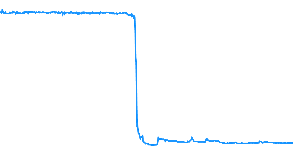
Terra - The Rise and Fall of LUNA/UST
Apr 17, 2023 - This dashboard gives a quick view on the price action of both UST and LUNA pre and post depeg. i cri evry tim

33. Voting Behavior
Jul 7, 2021 - In this dashboard, we use ethereum.events_emitted to take a look at the voting behaviors of the top 5 addresses that have had tokens delegated to them for voting. After determining the top 5 (see data below) I assigned each of them a rank 1 through 5. 1 - 0x2b1ad6184a6b0fac06bd225ed37c2abc04415ff4 2 - 0xe02457a1459b6c49469bf658d4fe345c636326bf 3 - 0xbbf3f1421d886e9b2c5d716b5192ac998af2012c 4 - 0x6626593c237f530d15ae9980a95ef938ac15c35c 5 - 0x61c8d4e4be6477bb49791540ff297ef30eaa01c2 Then I created a chart to investigate their respective voting behaviors and found the following information. Rank 1 voted on three different proposals. They casted approximately 15 Million votes each towards proposal IDs 1, 3, and 4. Rank 2 had no votes cast towards any proposal. I did not find any voting participation at all. Rank 3 voted with approximately 13.38 million votes towards proposal ID 3. Rank 4 had the greatest variety and involvement in an array of proposals. Approximately 10.67 million votes towards proposal ID 1. Then ~126k votes towards each proposals 31, 35, 36, 37, 38, 39, 40, 42, 43, 44, 45, 46, 47, and 49. Rank 5 voted with approximately 10.45 million votes each towards proposal IDs 1, 4 and 5. They also designated 50k votes each towards proposal IDs 42 and 43. In the last month, each rank 1, 4 and 5 have been active. Rank 3 has not been active since 12/23/2021, while 2 seems to have never voted.

LunaBulls - Iced Out - All Traits
Jan 18, 2022 - This dashboard displays the breakdown of all traits held by Iced Out bulls.

19. Active Liquidity
Jun 2, 2021 - Objective: Find the 5 largest liquidity pools in Uniswap V3. What percentage of positions and what percentage of virtual liquidity (liquidity_adjusted) are currently out of range? When this occurs which is the approach most taken: updating the range or waiting it out. - It seems as though for the extreme DAI/USDC/USDT relationships, that the only option is waiting it out. Conclusion: The only two pools that were considered to be "out of range" by my calculations where DAI-USDC 500 10 and USDC-USDT 500 10. I define pools that are "out of range" to be positions where the liquidity adjusted is greater than gross liquidity. These percentages are fairly negligible, but can be calculated to be the following: With 129,584 (USDC-USDT 500 10) positions, 91 positions would be .07% out of range. With 97,541 (DAI-USDC 500 10) positions, 103 positions would be .106% out of range. Finally, I compared the total sum of position liquidities vs the gross liquidity for each pool, and got the following results: Position Liquidity vs Gross Liquidity DAI-USDC 500 10 - 129,962% USDC-USDT 500 10 - 97,879% USDC-WETH 3000 60 - 18.10% WETH-USDT 3000 60 - 10.57% WBTC-WETH 3000 60 - 0.09% Really interesting to see the DAI/USDC/USDT relationships SIGNIFICANTLY outweighing the WETH and WBTC relationships. Not super surprising given the lower-risk potential there, but still amazing to see it written in the data. Please take a look at all of the data below for my references.

34. DeFi Users vs Newbies
Jul 7, 2021 - A poor attempt at this bounty, but still some interesting information! Over the last 7 days, how the totals of UNI holders (>100UNI) vary in other holdings!

Hellcats + Hellhounds NFT Stats
Jan 5, 2023 - Dashboard to display the total Hellcats and Hellhounds stats on OnePlanet since launching on Polygon. https://twitter.com/brian_terra_

36. Active LPs New Position Count
Jul 14, 2021 - For the 10 most active LPs in WETH - USDC pools, how many times have they opened a new position when they had an existing position they could have repurposed in the past 30 days?


